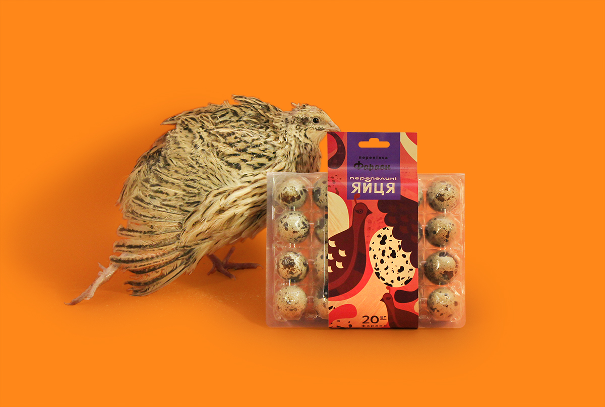
Quail Eggs packaging design development
Useful product - a bright product!
How do you imagine quail eggs? Green? Orange? Purple? …Why not?!
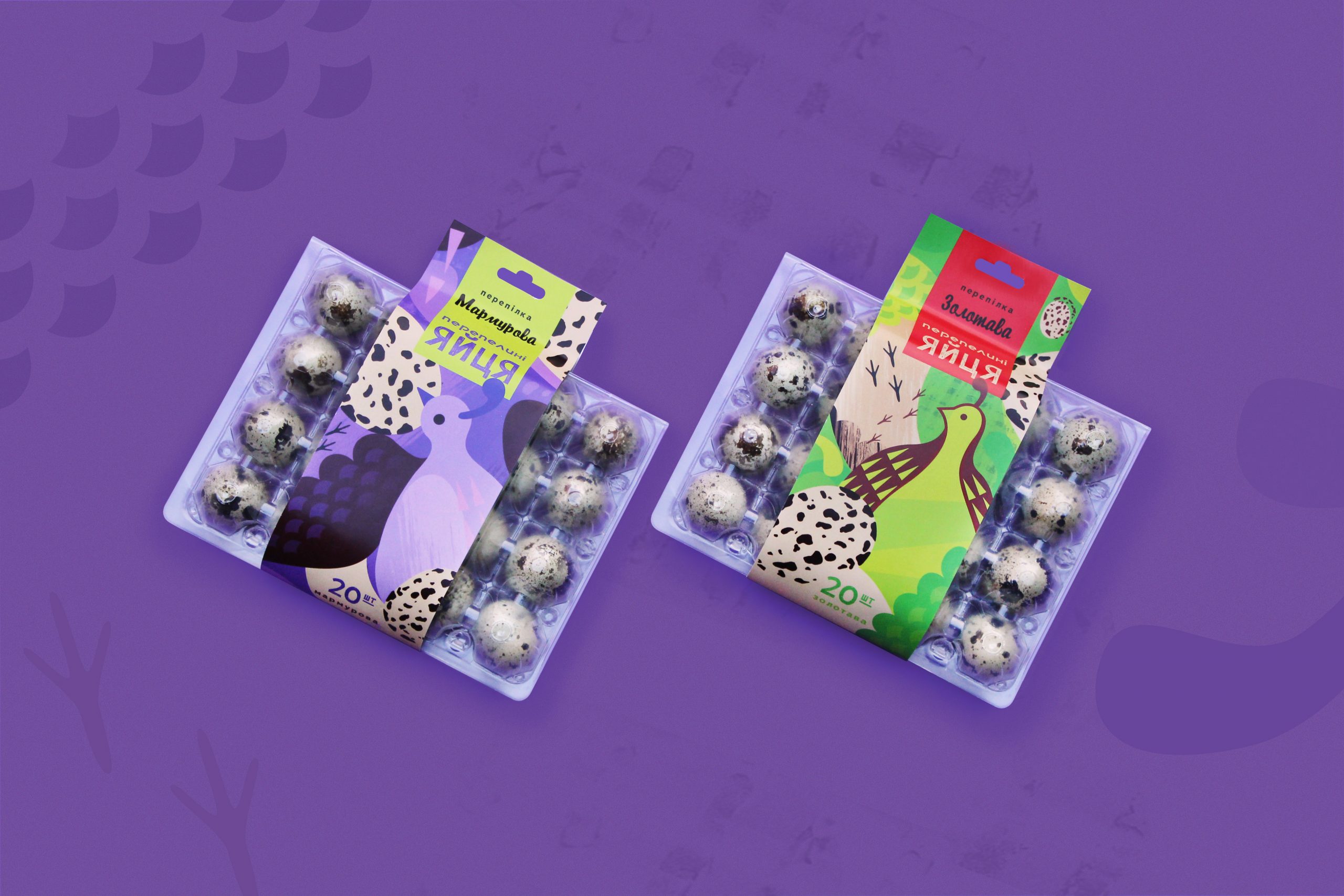
The main idea of the packaging series is color emotion.
Each color corresponds to the breed of quail and has unique beneficial properties of quail eggs.
Complementary colors and tonal harmony used in the packaging line distinguish it from
other goods on store shelves. Abstract illustration that we use in packaging,
engages the consumer's imagination in dialogue and creates history. Infographics on the back of the package adds
playfulness, readability and conciseness of the image.
Now the eco product of quail eggs is a good mood and bright emotions!


