Meteorite packaging design development
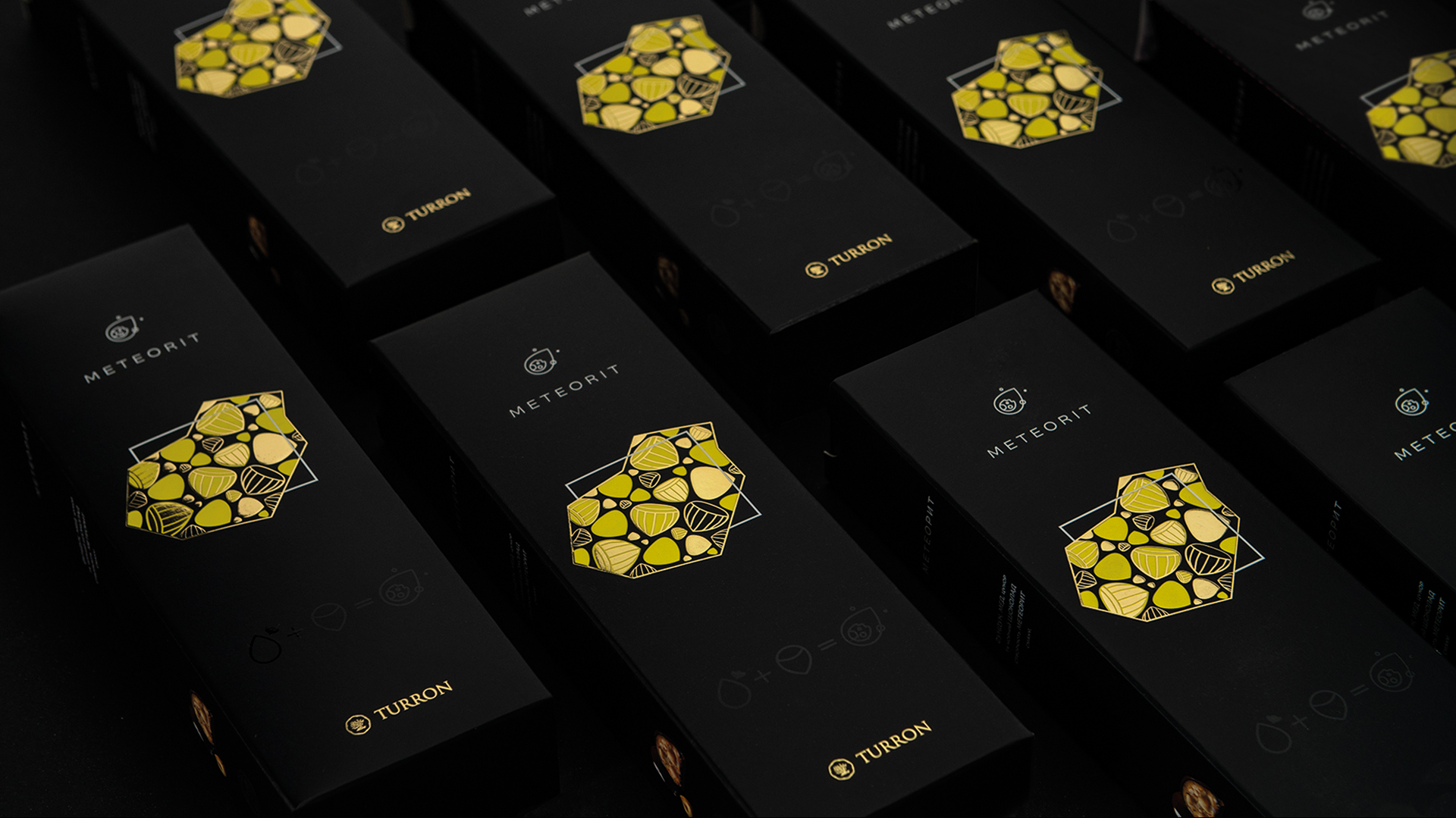
Our task is to show the audience a new product, while maintaining the recognizability of the already well-known, previously developed by us elegant style of the brand. The main visual points of reference remained abstract graphics, the division of the silhouette block of the meteorite image into several levels, with the use of non-standard tactile effects, executions of high-quality printing methods.
The meteorite of taste is nuts, honey, and abstract graphics - so we built a new image based on Turron's premium rigor. The laconic nature of the design is supported by printing tools: a special lacquer application highlights candy on a velvety matte background, brightly presenting the new product to consumers.


